When we started talking about what the style of our film should be I imidetly thougt of a short animation film called "Replay" (http://www.youtube.com/watch?v=g-cFHeoXAw8)
It`s a beautifull film and I love the art direction. Rest of the group liked the style and we all agreed that we would try to make something similar to this.
I said early that I would like to be the art director of the film, with me I got Mathias as modeler and texturer.
Starting the project me and Mathias tried out the scenes with different textures and made it a bit random. Then I read an issue of 3D World and saw theire article about "color theory", this changed our texturing a whole lot.
So I retought the textures and found out we would make the enviroment warm and welcoming while the character would be cold, seeing that he wasen`t really supposed to fit in.
So after reading alot about color theory and seeing usefull pointers like this we found our style in the film.
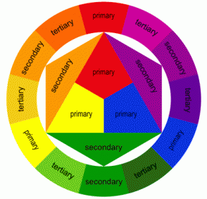
The picture above is a map showing complementary colors and triad colors. If you draw a straight line throug the circle (from one color to another) you get the complementary colour. This is the basic principle in most films, and they usually do the trick.
Intuitive art directors take this many steps further, and thers many different "color relationships" The new Pixare film "Up" used a triad color selection. This means they used "three" colors. They aren`t bound to only use this three colors, but the three colours are used one the things that are supposed to stand out the most.
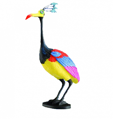
The bird below is a good example from that film, using bright colors and maonly three colors. Yellow, red and blue. Nice peace of work.
The picture above is a map showing complementary colors and triad colors. If you draw a straight line throug the circle (from one color to another) you get the complementary colour. This is the basic principle in most films, and they usually do the trick.
Intuitive art directors take this many steps further, and thers many different "color relationships" The new Pixare film "Up" used a triad color selection. This means they used "three" colors. They aren`t bound to only use this three colors, but the three colours are used one the things that are supposed to stand out the most.
The bird below is a good example from that film, using bright colors and maonly three colors. Yellow, red and blue. Nice peace of work.
 RSS Feed